County of Marin Identity Style Guide
Guide County staff, designers, and vendors in applying the County of Marin logo consistently, while allowing appropriate departmental and agency expression.
Updated September 30, 2026
Purpose
Guide County staff, designers, and vendors in applying the County of Marin logo consistently, while allowing appropriate departmental and agency expression.
- Promote a uniform portrayal of the County.
- Create continuity across departments and agencies.
- Improve efficiency in producing stationery and other materials across County government.
Background & significance
The main graphic element is a drawing of the Marin Civic Center designed by Aaron Green, Frank Lloyd Wright's West Coast Representative and Architect of Record for the Marin Civic Center.
The symbol represents:
- transparent governance
- environmental preservation
- healthy, sustainable and safe communities
Logos
- Use supplied artwork; identity art should never be altered or recreated.
- Do not stretch or distort logos or logotypes.
- Provide enough breathing room around logos and do not overlap them with other logos or graphics.
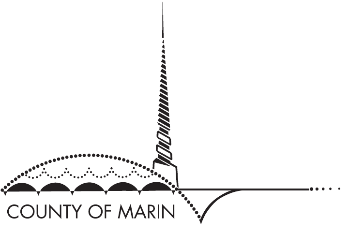
Primary Logo Preferred
Civic Center symbol plus County of Marin logotype in black lines and type.
First choice when representing the County of Marin.
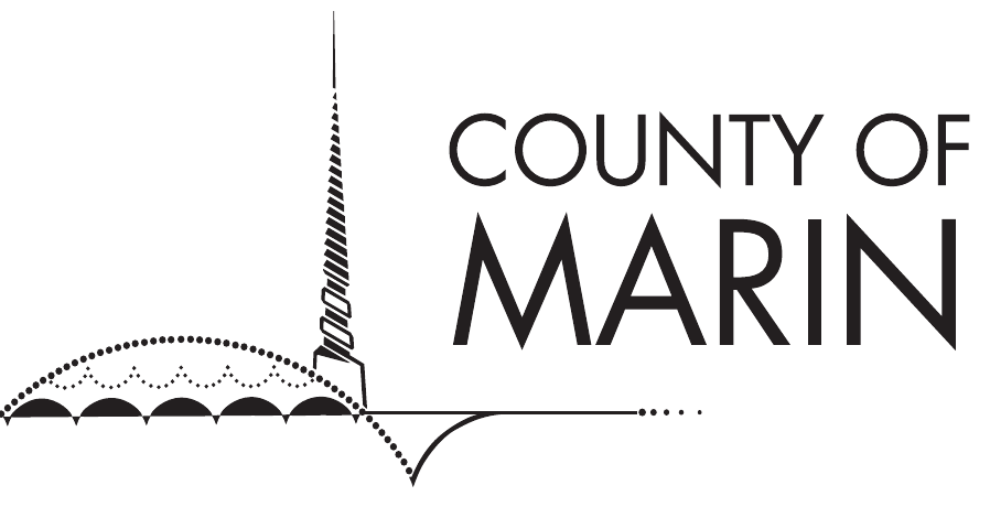
Secondary Logo
Civic Center symbol plus the secondary County of Marin logotype.
Use when layout space requires a smaller, more compact logo while keeping County of Marin legible.

Primary Logotype
COUNTY OF MARIN in Futura, all caps, on one line.
Preferred typographic representation when the full logo is not appropriate.
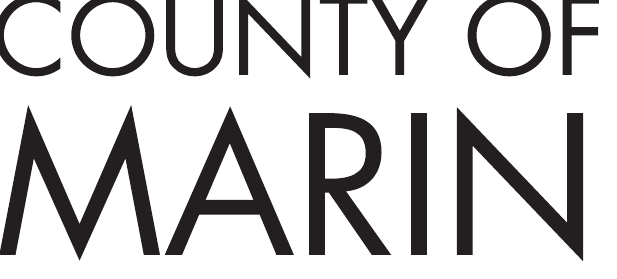
Secondary Logotype
COUNTY OF above MARIN in a compact stacked arrangement.
Use where horizontal constraints call for a more compact typographic representation.
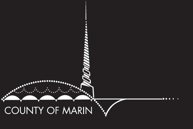
Primary Logo Reversed
Use on dark or black backgrounds; replaces black line art and typography with white.
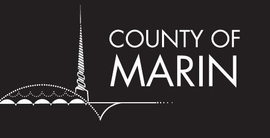
Secondary Logo Reversed
Use on dark or black backgrounds; replaces black line art and typography with white.

Primary Logotype Reversed
Use on dark or black backgrounds.
Secondary Logotype Reversed
Use on dark or black backgrounds.
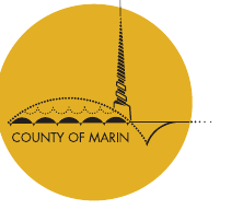
Circular Seal
Primary Logo with a solid gold circle behind it, with the spire and dotted horizon line breaking out.
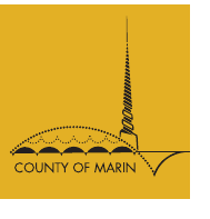
Square Patch
Primary Logo contained within a square with the horizon line shortened to fit.
For cases where production constraints require the logo to be contained within a shape.
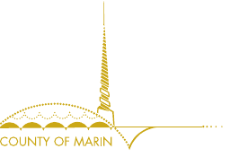
Gold Symbol
Primary Logo with the spire changed from black to gold.
The guide labels this treatment for metallic or foil printing only.
Logo graphic
The primary logo without the County of Marin logotype, converted to 15% black/gray for use as a design element on print or presentation materials. 15% black only for this purpose; do not alter.
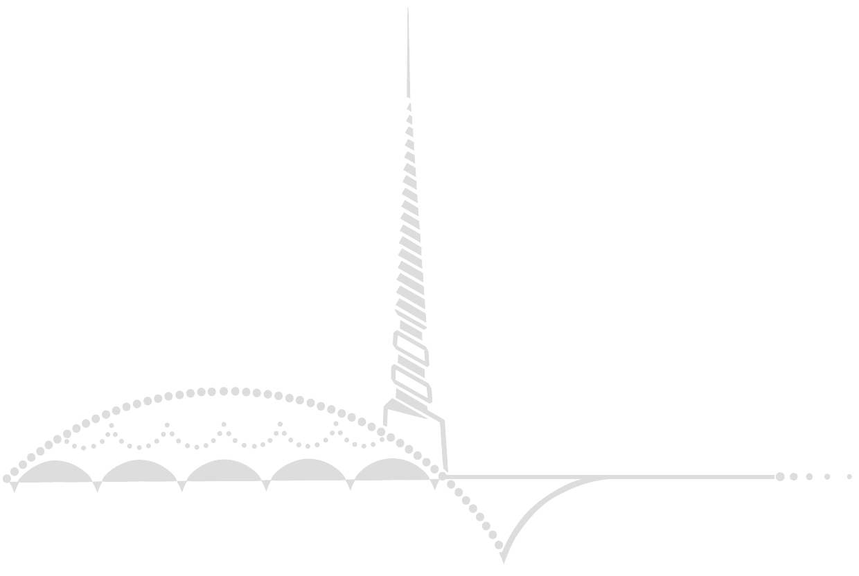
Logo Graphic
Color palette
Black and gold. Black is used for line art and typography; gold derives from the Civic Center spire and is used in special cases.
Six additional colors derived from the building or surrounding environment. Blue should be used sparingly, primarily as an accent. Grays may be used for lighter logo screens; remaining colors may be used as larger backgrounds or in graphics such as charts and graphs.
Use of the palette is intended to create continuity and a strong family brand across departments and agencies.
Typography
- Futura
- official logo/logotype art, headline, subhead
- Arial
- preferred body copy, print materials
- Georgia
- serif body copy when needed
- Verdana
- website (per 2014 guide)
File formats
County of Marin identity art should never be altered or recreated.
- EPS — Vector-based format for high-resolution print applications. (PMS spot colors, CMYK) Vector artwork can be enlarged without losing quality.
- Web & electronic
- PNG — For web, on-screen and Microsoft Office applications; selected for line-art quality, smaller size and transparency support. (RGB)